Diary of a Divi 2.5 Upgrade
Almost all of my website designs these days are built using WordPress and the Divi theme. I love Divi because it gives me a great toolbox to build engaging and good looking designs without a lot of hard coding. I’m not scared of a little .CSS and .PHP, I just prefer Divi’s drag and drop, WYSIWYG environment.
This past spring, Divi underwent a MAJOR upgrade, which really took Divi’s design possibilities to a new level. However, as they say, “No pain, no gain”. The upgrade from 2.3 to 2.5 broke many of the customizations I’d made to my Divi sites, despite my having used Child Themes to implement them. Fortunately I’d tested out the upgrade in my WPEngine Staging Area development environment first, so I knew to hold off on the live upgrades until I’d had a chance to patch things up.
Why Did I Write This Diary?
One of my aims when I set out to do this upgrade was to remove what I could from the .CSS of my child theme, and make those customizations instead using the Divi Theme Customizer and the Divi Module Customizer, because I felt this would better “future-proof” the site as more Divi upgrades came down the line. Plus, while I’m pretty comfortable with .CSS, I don’t exactly love coding it.
Figuring that I couldn’t be the only one running into Divi upgrade snags, I decided to document the process of one of my upgrades, to maybe help other Divi site developers who are in the same shoes. So here goes with my “Diary of a Divi Upgrade”…
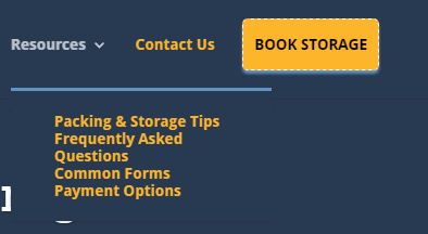
Custom Call To Action Button in header.php Moved
I like to have a call to action button in the top right hand “sweet spot” of lots of my websites. To place this immediately right of the primary Divi menu, I had added some code to the header.php of my child theme, and styled it with .CSS in the Divi Theme Options epanel. After the upgrade to Divi 2.5, this same button had somehow moved itself into an awkward position, well above the menu.
Rather than messing around the header.php files from the new Divi 2.5, and updating my child theme accordingly, I decided instead to try styling the rightmost button within the primary menu to achieve a similar effect. So the first thing I did was rename the header.php file in my Divi Child Theme folder to header-old.php using Filezilla. Now my website was using the native Divi 2.5 header.php file instead of my broken child theme version.
Following this tutorial on Geno Quiroz’s tutorial site, I then used .CSS in the Divi Theme Options ePanel to style that one right hand button.The downside with this is that the “Book Storage” button is on the bottom of the mobile menu, instead of the top right hand side of the mobile screen. However, because I’ve got a Call To Action button in my slider that appears “above the fold” on mobile I still have an obvious call to action on mobile that I’m happy with.
Top Right Hand Corner “Book Storage” Call To Action Pre-Divi 2.5 Upgrade

Top Right Hand Corner “Book Storage” Call To Action Mid-Divi 2.5 Upgrade

Top Right Hand Corner “Book Storage” Call To Action Post-Divi 2.5 Upgrade

Logo Now Too Small
I was happy with my logo size in the site’s prior version, and for some reason this was made much smaller after the upgrade. In Divi 2.5, however, this is easy to change using the new Divi Customizer, in Header & Navigation > Primary Menu Bar. Fixed. See the before and after below.
Fullwidth Sliders Wonky
I had spent some time getting my fullwidth slider heights and padding just so, pre-upgrade, and after the upgrade, things just weren’t lining up as cleanly. So I commented out my .CSS edits for the sliders, and made the changes instead in the Divi Module Customizer > Fullwidth Header.
Fullwidth Slider Pre-Divi Upgrade

Fullwidth Slider Mid-Divi Upgrade

Fullwidth Slider Post-Divi Upgrade

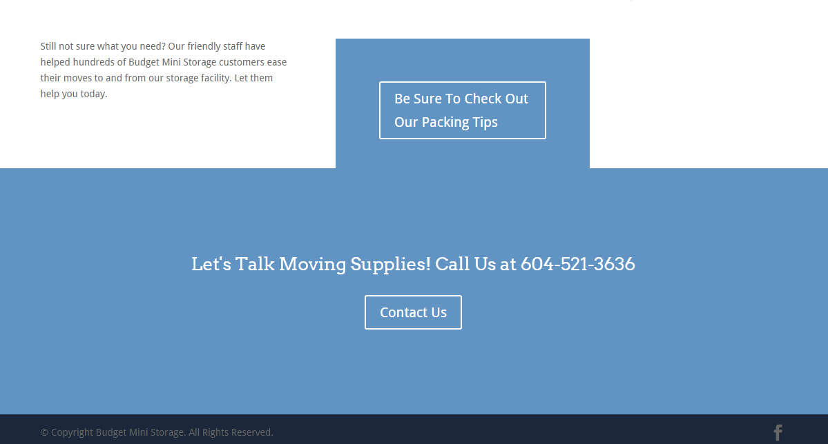
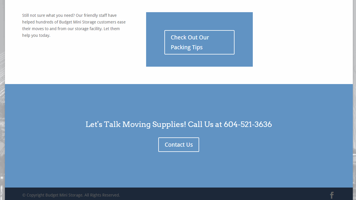
Padding On Call To Action Boxes
I had also customized some Call To Action boxes which I had felt were too large, and these edits too were no longer behaving. So I commented out these CSS edits and adjusted the padding using the Divi Module Customizer > Call To Action.
This left one Call To Action box overlapping another in one instance, so to tweak this, I added a row beneath the Check Out Our Packing Tips box, added a Divider Module, and set the height to 1px, the colour to #fff and visibility set to Show Divider. Problem solved.
Call To Action Boxes Mid and Post Upgrade
Primary Menu Fixes
In my pre-Divi 2.4 version of this site, my menu text turned blue on hover, instead of just a somewhat transparent version of the inactive text, which is the Divi default. I wanted to keep this, so I left that in my CSS as before.
I had also changed the color of my mobile menu, and again, this was now an option in the Divi Customizer, so I commented that CSS out and changed the mobile menu color (“hamburger” and font) to 3fff (white) in the Divi Customizer > Mobile Styles > Mobile Menu.
Finally, I was not happy with the line spacing on the drop down menus, and I couldn’t figure out how to do that with the Divi Customizer, so I resorted to tweaking that via CSS:
/*add leading to submenu items————————*/
.nav li {
position: relative;
line-height: 2em;
}
Submenus Before and After CSS Edit
Secondary Menu Fixes
I had styled the email and phone number fonts to be bigger and white, using CSS, but I found that I was able to achieve what I wanted using the Divi Customizer > Header & Navigation > Secondary Menu Bar, so I commented out that CSS and made the changes directly in the Divi Customizer instead.
Favicon Missing
For whatever reason, I seemed to have lost my favicon (the mini icon that shows up in the Chrome tab next to your site name), but I found a place to upload it in the Divi Customizer at General Settings > Site Identity> Site Icon, so I added it there. Problem Solved.
Contact Form 7 Styling Intact
I use the Contact Form 7 Plugin for my form, and had a bunch of CSS styling to match it to Divi’s look and feel. Fortunately that CSS all still works, so I didn’t need to make any changes there to keep the form looking sharp.
Other CSS No Longer Needed
I had added line height to my headings through CSS because I found the leading on all the titles to be too tight, but now I was able to adjust that in the Divi Customizer in General Settings > Typography> Header Line Height.
I had also added CSS to force the Calls To Action in the fullwidth sliders to appear on mobile, but in this upgrade they appear to do so anyways, so that code, too, has been removed.
Below you can see my CSS “before and after”. Everything I commented out and then eventually deleted (to keep things clean and tidy) is “struck through” for your reference.
In Conclusion
My final step was to login to my live site via FTP and delete the header.php from my Divi Child Theme Folder in WP Content>Themes, since I didn’t need it anymore. Then I took final backups of both the live and development sites and went live with the development site via WPEngine “Staging to Live” function.
I hope you have found this useful. I have one more much larger Divi site to upgrade, and I now feel I’m ready to take it on!
Please share any tips you have on upgrading your sites from Divi 2.3 to Divi 2.4 or higher in the comments below. I’d love to know if you have hit any of the same snags I have, and how you addressed them.
Contents of My Custom CSS in the Divi Theme Options ePanel
/* Style main page slider and rates page slider…………………………………………. */
body.page-id-2 .et_pb_slider {height: 380px;}
body.page-id-2 .et_pb_slide_video {padding-top: 10px;}
body.page-id-2 .et_pb_slide_with_image .et_pb_slide_description {padding-bottom: 50px; padding-top: 50px;}
body.page-id-90 .et_pb_slider {height: 290px;}
body.page-id-90 .et_pb_slide_video {padding-top: 10px;}
body.page-id-90 .et_pb_slide_with_image .et_pb_slide_description {padding-bottom: 50px; padding-top: 50px;}
/* Header Button (from header.php) …………………………………………. */
#header-button {
float: right;
font-size: 13px;
font-weight: 600;
text-transform: uppercase;
margin-left: 15px;
margin-top: 4px;
opacity: 1;
padding: 7px 10px;
background-color: #FEB62C;
border-radius: 3px;
box-shadow: 0 3px 3px #6194c3;
border-width:1px;
border-style:dashed;
}
a#header-button:hover {color: #ffffff;}
a#header-button {color: #293b53;}
/* style email and phone along top in secondary menu———————————————————— */
#et-info-email{
color: #Ffffff;
font-size: 14px;
margin-right: 13px;
}
#et-info-phone {
color: #Ffffff;
font-size: 14px;
margin-right: 13px;
}
/* change colour of mobile menu ————————- */
.et_mobile_menu li a {color: #FFF;}
/* up size of header subheader on fw headers————————————————————*/
.et_pb_fullwidth_header p {
font-size: larger;
}
/* reduce padding on CTA on Commercial ———————————————————— */
.et_pb_section {
padding: 10px 0;
position: relative;
}
/* reduce padding on CTA on Residential ———————————————————— */
.et_pb_promo {
padding: 70px 40px;
}
/* Force CTA on sliders on mobile————————————————————*/
@media only screen and (max-width: 479px){
.et_pb_slide_content, .et_pb_more_button {
display: block !important;
}}
/* Change line height on headings ———————————————————— */
h1, h2, h3, h4, h5, h6 {
line-height: 1.2em;
}
/* change colour of main menu on hover ————————————————————*/
#top-menu a:hover{
color:#FFFFFF !important;
}
/* Contact form 7 style
———————————————————— */
.wpcf7-text, .wpcf7-textarea, .wpcf7-captchar {
background-color: #eee !important;
border: none !important;
width: 100% !important;
-moz-border-radius: 0 !important;
-webkit-border-radius: 0 !important;
border-radius: 0 !important;
font-size: 14px;
color: #999 !important;
padding: 16px !important;
-moz-box-sizing: border-box;
-webkit-box-sizing: border-box;
box-sizing: border-box;
}
.wpcf7-submit {
color: #2EA3F2 !important;
margin: 8px auto 0;
cursor: pointer;
font-size: 20px;
font-weight: 500;
-moz-border-radius: 3px;
-webkit-border-radius: 3px;
border-radius: 3px;
padding: 6px 20px;
line-height: 1.7em;
background: transparent;
border: 2px solid;
-webkit-font-smoothing: antialiased;
-moz-osx-font-smoothing: grayscale;
-moz-transition: all 0.2s;
-webkit-transition: all 0.2s;
transition: all 0.2s;
}
.wpcf7-submit:hover {
background-color: #eee;
border-color:#eee;
padding: 6px 20px !important;
}
/* Call to Action Button from http://quiroz.co/transform-a-divi-menu-item-into-a-cta/
——————————————————————
adjust the padding of the top menu navigation bar */
#main-header { line-height: 0px; padding-top:14px;}
#main-header nav#top-menu-nav {padding-top: 0px;padding-bottom: 10px;}
/* adjust the padding of the top menu navigation items */
#main-header.et-fixed-header nav#top-menu-nav {padding-top: 0px;}
#top-menu li { padding-top: 20px; }
#top-menu li li a, .fullwidth-menu li li a {padding: 0px 20px; line-height: normal;}
/* adjust the padding and height of the fixed header logo (when scrolled down) */
.et-fixed-header #logo {
max-height: 39px;
padding-top: 1px;}
/* style the get-started cta button————————————– */
.get-started {border-radius: 5px; height:48px;
box-shadow: 0 3px 3px #6194c3;
border-width:1px;
border-style:dashed;}
.get-started a {color: #000!important;}
li.get-started {
color:#fff!important;
background-color:#FEB62C;
text-align: center;
text-transform: uppercase;
padding-left:10px;
padding-right:10px!important;
-moz-transition: all 0.5s;
-webkit-transition: all 0.5s;
transition: all 0.5s;}
li.get-started:hover {background-color:#f4a80e;}
/* mobile styling of menu button————————————*/
@media (max-width: 980px){
li.get-started {
text-align: left;
padding-left: 0px;
}}
/*Top menu tweak to centre Book Storage horizontally in button————————*/
#top-menu li {
padding-top: 12px;
}
/*add leading to submenu items————————*/
.nav li {
position: relative;
line-height: 2em;
}